Designing for Digital Print
What is the difference between CMYK and RGB?
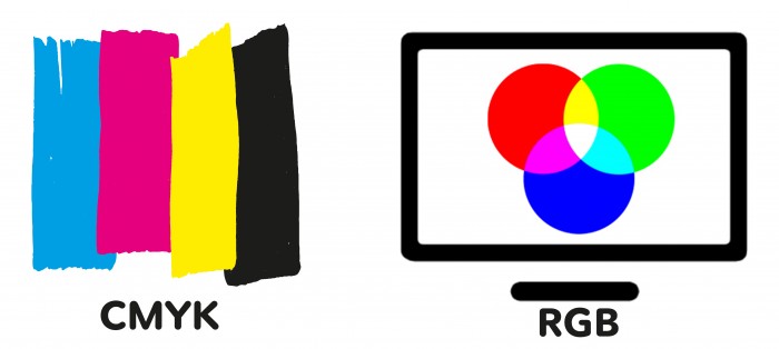
CMYK stands for Cyan, Magenta, Yellow and Black - the inks we mix together to produce your printed material.
RGB stands for Red, Green and Blue - the colours of light a computer screen mixes together to make colours on screen. In other words RGB is used for viewing colours on a computer screen, like this website.

All our presses, big and small, use cyan, magenta, yellow and black inks to transform your digital file to printed media. Please ensure your artwork is set up as CMYK. If you use RGB images or colours we will convert these to CMYK for you but the colour of your printed file may appear different when printed.
Avoid rich black text
Rich black is a CMYK mix. No registration is absolutely perfect; there is always a little shift or stretch. Make sure that all black text is set at 100% black. This means the text is only printed once with the black plate, eliminating registration problems.
Solid black areas of colour
With digital printing, you don’t need as much ink to achieve a good black solid. In fact, if you use too much ink your print will suffer in quality and may require lamination to protect the printed layer. If you want a rich black solid, use these values:
30% Cyan, 30% Magenta, 30% Yellow, 100% Black. This gives you an overall ink coverage of 190%
Transparency Effects and Spot Colour
If your software’s colour palette is using nothing but CMYK colours, you can use transparency with no problems. If you import a logo or a piece of artwork with a predefined Pantone or spot colour, then you are also importing that colour into your palette. If you apply the spot colour to text or graphics and use a transparency effect on them, it will result in the object printing blank or with an unintended colour. The job may print fine on a desktop printer or create a pdf file that appears fine on screen. However, we will most likely not be able to convert the spot colour to CMYK and retain the correct transparency effect as we do not have your original file. You must convert the spot colour to CMYK in your original file before you export to pdf.
Files Containing Transparency Effects - Flattening
Before being “flattened”, a transparency is considered “live” and exists as an optical effect onscreen. It should be "flattened" before going to print. When flattened, the transparent region is broken up into smaller non-transparent sections that can then be translated by the RIP (raster image processor) into a printable image. It is, however, a complex process and trouble spots arise from the use of spot colours as discussed above, where text or vector objects overlap pixel-based objects and possibly RGB or CMYK images. Converting your spot colours to CMYK and flattening transparency effects before you send your file to print, will ensure your file is printed correctly.
Grey Text
Grey ink is not used when printing in CMYK digitally. A pattern of dots or "screen" is used to achieve grey, e.g. not a solid colour. Small point sizes below 7pt or thin fonts might look only partially printed when coloured grey.
There are two ways to produce grey.
- CMYK - A light grey made from all 4 colours will appear more solid as there are more dots used but this can cause registration issues.
- Black Ink (K) - A light grey made from black ink will not have registration issues but the dots will be more visible as there is only one colour used.
Using fonts at small sizes
Be careful when using small font sizes. We don’t recommend smaller than 7pt for small format work up to A3 and 11pt for large format above A3. Remember, the smaller the text the harder it is to keep in register. If you have to use small text we recommend you use 100% black to eliminate any registration problems.
SVG Fonts or Type 3 Fonts
The support of SVG fonts or Type 3 fonts for print reproduction can produce very mixed results. For this reason, you should convert Type 3 fonts into normal graphical content to avoid unpleasant surprises during output. You do not need to convert text that use normal font types as long as you have embedded the font in the pdf.
Images
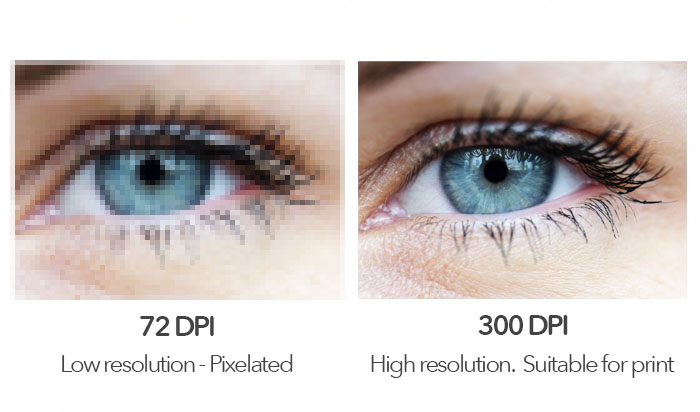
All images should be 300 dpi. DPI is the amount of ink dots per inch; 300 dots per inch is the required standard for printed material. Images should also be placed at 100% size in your final document. For example, if your image is 50mm x 50mm at 300dpi, then it is also that size when placed in your document. Lower resolution compromises image quality and may result in pixilation (where the pixels, tiny squares or dots that make up the image, are apparent when printed).
Please note that opening a 72 dpi image in Photoshop and simply changing the dpi to 300 will not increase the quality of the image.

Borders and artwork
As there is always a small degree of movement when printing and finishing a job, it is recommended that your artwork is at least 5mm from the edge of the page if it is not meant to bleed off. This is known as the ‘safe area’. Avoid printed borders placed too close to the edge of a page as they may look uneven when the job is trimmed.
Overprint
Please check your overprint settings carefully. All overprinting must be correct in a print ready PDF as it is not always obvious to the printer.
Using overprint preview in Acrobat will give you a guide as to which colours will overprint and which will remain unchanged.
White text
Do not set white text to overprint. Setting a colour to overprint lays a colour over the top of another colour. White in CMYK terms is 0%, so if you overprint zero ink on top of another colour it will disappear.
Bleed
It is important that you supply all your artwork with 3mm bleed. click here for a detailed explanation.
Layers
Applications such as Adobe InDesign can create PDF files containing layered content. Printing a PDF file that contains layered content may mean that only the layer that is currently visible onscreen is printed. You should always “merge” or “flatten” the layers when creating a print-ready PDF.
Multiple-page PDF
Do not impose the pages or save them as reader’s pairs, this is not print ready. We require a PDF consisting of single pages running from the front cover through to the back cover. If blank pages are needed in the final book they need to be included in the document. For saddle-stitched books please remember that the number of pages in a book must be divisible by four (24pp 32pp 40pp etc). If your PDF has 10 pages you will need to add 2 blank pages to make it work.
Why it is important to give us pages in their running order
Instead of supplying, for example, the front and back covers first, followed by the inner pages, it’s important to supply pages in numerical order, with the cover being the front page and the back page being the last. This ensures your document is printed correctly in the order you want.
The difference between pages and leaves
A leaf is a sheet of paper and a page is typically a side of paper, So a leaf of paper could be two printed pages (2pp) if double sided or just one printed page (1pp) if single sided.
Check your folding is correct
If the document is to be folded, such as an invitation or leaflet, the folding will need to be checked before supplying us the PDF. It’s always a good idea to print a copy out on your desktop printer. Check the pages back up correctly and that the text doesn’t run into the folds, unless intended.


